UX Strategy
User journeys, IA, and content hierarchy to reduce friction.
- User flows & sitemaps
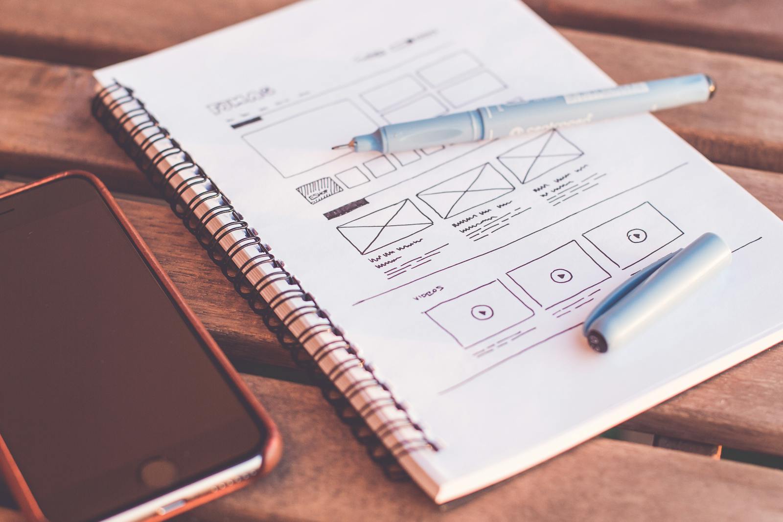
- Wireframes
- Content strategy
We craft clean, modern websites and landing pages that tell your story, guide users, and drive measurable outcomes.
From strategy to polish across responsive, accessible, and fast experiences.
User journeys, IA, and content hierarchy to reduce friction.
Clean, modern interfaces with a clear visual hierarchy.
Thoughtful breakpoints so layouts adapt beautifully.
Friction‑less CTAs, forms, and trust signals that convert.
Clear copy and information hierarchy that supports decisions.
Reusable components and tokens for consistent growth.
We design with purpose: meaningful hierarchy, generous spacing, readable type, and strong calls‑to‑action—so every page guides users to the next step.
Selected marketing and product UI work.

Above‑the‑fold clarity and strong social proof.

New brand system and pattern library.

Accessible components and dark mode ready.
Aligned stakeholders, fast feedback, and clear milestones.
Audience, goals, and value props. Content outline.
Navigation, IA, and modular sections.
Brand application, components, and states.
Click‑through flows and usability checks.
Specs, tokens, and dev‑friendly assets.
Measure, test, and improve over time.
Type scales that adapt across breakpoints with balanced line‑length and contrast.
Consistent tokens for brand, surfaces, states, and feedback with contrast in mind.
Answers to common questions about our web design process.
Yes. We can deliver design only, or design + development together with our engineering team.
We can extend your brand system or create a new micro‑brand for specific campaigns.
We design with WCAG in mind—contrast, semantics, focus, and keyboard support.
Tell us your goals; we’ll shape the story and the screens.